“Designing High-Impact,
Low-Bandwidth Messages to Help People Act Quickly”
Our
February 26th event explored the principles of structured information design for developing static visual information, which you can apply to any medium — including printed text, interface designs, or Web content. These techniques help us create messages that enable our audiences to interpret, retain, and apply information quickly and accurately.
Why is this important? As a consumer, if you have ever wrestled with baffling product information, or missed the point of a memo or a company procedure, you may have observed that the inability to understand and act on information can have significant consequences. This event explained how a poor visual presentation can stand in the way of people understanding and taking action.
Whether you use plain text and graphics, HTML, XML, or some other format, it doesn’t really matter because the end result is the same — it is some kind of visual display. Non-static visual media, including multimedia video, animations, and audio-visual presentations, have different sets of guidelines and supporting research, so we plan to save those topics for future discussions.
This
session covered two parts pertaining to structuring textual and graphic information, which are expanded in the summaries below.
 In Part 1, Adele Sommers covered: In Part 1, Adele Sommers covered:
- The information challenges our audiences (e.g., customers, colleagues, and employees) face today in business communications
- Where we often encounter information design shortcomings in business
- Five information design solutions that can resolve those shortcomings
- Why those solutions work, and what body of research supports them
 In Part 2, Bruce Mills covered: In Part 2, Bruce Mills covered:
- How to apply principles of structured information to illustration and graphic design
- Ten steps for designing "high-impact, low-bandwidth" graphics
- Common graphic design pitfalls we should strive to avoid
Part 1 Summary
“Designing Information to Help People Act Quickly”
by Adele Sommers
Today's media-saturated world challenges people to comprehend and respond quickly to a plethora of visual messages! Did you know that more than 300,000 new book titles appear annually, and over 18,000 magazines exist just in the U.S.? Our colleagues, employees, and customers are all overloaded and attention-limited! The competition for their attention is fierce, and not likely to subside any time soon.
For this reason, it's quite possible that our news-based and "how-to" information — such as memos, newsletters, policies, procedures, instructions, user manuals, and system interfaces — may just be adding to audience overwhelm instead of helping people perform. After all, we also want people to view our persuasive information, such as advertisements, marketing blasts, and commercial announcements. Multiply that by the number of competitors we have who are doing the same exact thing, and it's easy to see why our materials don't receive attention!
 To remedy this situation, we need to "grab people by the eyeballs" and give them more control over what we submit for their attention. We must enable our audiences to scan, skip, and retrieve — and then act on the information fast, before the relentless demands on their time force their attention to shift elsewhere. To remedy this situation, we need to "grab people by the eyeballs" and give them more control over what we submit for their attention. We must enable our audiences to scan, skip, and retrieve — and then act on the information fast, before the relentless demands on their time force their attention to shift elsewhere.
The information we design must be "high-impact" to get attention, but also "low-bandwidth" in terms of the effort and brain-power required to process it. The easier the information is to process, the more readily people will:
- Retain the information
- Retrieve from it memory under the right circumstances, and
- Apply it correctly
As part of the solution, this article discusses five powerful information design techniques that can boost our audience's ability to interpret and respond.
First, What Shortcomings Do We Find in Business Information?
 On more than one occasion, you've probably encountered a puzzling user manual, bewildering procedure, baffling software interface, or confusing memo. Therefore, you've probably seen plenty of examples of dense, crowded text; long-winded, rambling sentences; a convoluted writing style; and a confusing layout. On more than one occasion, you've probably encountered a puzzling user manual, bewildering procedure, baffling software interface, or confusing memo. Therefore, you've probably seen plenty of examples of dense, crowded text; long-winded, rambling sentences; a convoluted writing style; and a confusing layout.
Why do these things matter? A poor visual presentation can delay or even prevent someone from understanding and taking action! The consequences include:
- Less interesting and less productive interactions that rob people's time.
- More mistakes and errors, while the potential for harm and dissatisfaction skyrockets.
- Customers and employees going elsewhere, especially because there are often plenty of competitors who can do the job better! But why let this happen when there are remedies available?
What Can We Improve Using Effective Information Design?
Information design principles can come to the rescue by:
 Easing the burden on the reader's brain through reducing the information processing load. Easing the burden on the reader's brain through reducing the information processing load.
- Working within the typical limitations of short-term memory.
- Using other extensively researched principles of perception and learning.
Five ways that information design techniques work their magic include 1) classifying, 2) chunking, 3) simplifying, 4) arranging, and 5) illustrating -- all approaches used in what's called "structured writing." The table below briefly discusses each method.
Technique |
Background Information |
1) Classifying organizes content into five actionable types:
- facts
- concepts
- processes
- procedures
- principles
By classifying information into these types, we can create specific content sections to support and complement one another.
For example, readers often need facts and/or concepts before they can use procedures. |
Facts are unique, standalone bits of information, e.g., "Over 300,000 book titles appear annually."
Concepts represent classes of ideas or objects. "Dog," "book," and "weather" are all concepts, and each represents many specific examples.
Processes describe how something works from a high-level point of view.
Procedures are clearly defined steps that explain in detail how to do something.
Principles are conditional decision-making rules that guide people's actions in different situations. |
2) Chunking breaks the content into smaller, more digestible messages. |
Short-term memory is very limited; humans can process only about 3–4 chunks of information at a time. By "chunking" material into smaller bites, we can reduce the information processing load. |
3) Simplifying uses very direct, "plain talk" to get ideas across fast.
Avoid "corporate-speak," "academic-speak," or a meandering style when you want a fast response! |
"Plain talk" uses the active voice and simple words to communicate ideas. The active voice uses a noun followed by a verb to show who is taking action: "The technician removes the tray from the table" (not "The tray is removed from the table"). Instructions in procedures are short and direct: "Remove the tray from the table." |
4) Arranging text and graphics with visual cues helps people scan, skip, and retrieve quickly. |
Gestalt psychologists studied visual spatial cues and perception in the 1920s. They learned that the use of visual cues helps direct attention fast.
Examples of visual cues include bulleted lists, tables, white space, headers, bolded text, labels, dividers, hierarchy, grouping, and relative size. |
5) Illustrating reinforces or replaces text with graphic elements. |
Much research shows that prose is less efficient and less effective than graphic elements. Robert Horn, author of "Visual Language" (who also developed Information Mapping®, a widely used structured writing system), is a leading authority. |
Why Do These Solutions Work?
Technique |
Background Information |
Structuring, chunking, simplifying, and arranging all aid comprehension. |
Dr. M. David Merrill and Robert Horn have each contributed a set of ideas and methods that use some or all of these techniques. These methods have been tested repeatedly and found to boost reading, retrieval, and learning speeds. |
Graphic elements further support the retention and application of information. |
Extensive multimedia research by Dr. Richard E. Mayer illustrates when and how to mix text and graphics or multimedia. The right blend produces optimal learning, retention, and application. |
All methods reduce errors and response time, while raising response quality. |
When you combine these techniques effectively, errors that occur from reader misinterpretations drop greatly. Response time also declines when it’s clear to people what to do and how to do it. |
In conclusion, don’t lose sight of your audience’s need to interpret and act quickly. Consider using information design principles -- classifying, chunking, simplifying, arranging, and illustrating -- to help guarantee their success.
A Fascinating Source of Business Diagrams
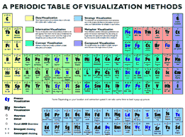 One of the things I shared in my presentation was an intriguing collection of diagrams, maps, charts, and other commonly used business visualization tools I came across at an interesting site called Visual-Literacy.org. One of the things I shared in my presentation was an intriguing collection of diagrams, maps, charts, and other commonly used business visualization tools I came across at an interesting site called Visual-Literacy.org.
The international team who compiled that collection devised an ingenious way to display it from a central map. To see it, you can follow this link to "A Periodic Table of Visualization Methods."
At first glance, it resembles the familiar periodic table of physical elements; however, that is where the similarity ends. Each cell in the this "periodic table" represents a different type of business diagram. When you move your on-screen pointer over each cell, an example of that diagram opens in a floating layer, and remains visible until you move your pointer away. The effect is very clever and innovative!
What are the benefits of this collection? For one, if you have forgotten what a particular diagram looks like, or you want to research which type of business tool might best serve your needs, these examples are excellent memory joggers and great sources of information.
Copyright 2007 Adele Sommers
Part 2 Summary
“10 Steps to Designing Effective, High-Impact,
Low-Bandwidth Graphics” by Bruce Mills
1. Organize:
Structure the message — key communication objectives must be well defined, structured and appropriate for graphic interpretation
2. Objectify:
Select presentation media — evaluate the context and application environment to determine optimal presentation medium and media:
- Illustrative, graphic, photographic
- Print, electronic, environmental graphics
3. Visualize:
- Walk through the story through the eyes of the target audience
- Set a theme and style for storytelling
4. Prioritize:
- Define relationships and organize visual priority of content
- Select a presentation hierarchy: tree (outline), matrix, map, grid (linear or polar), sequence
5. Optimize:
- Chunk down essential message elements to the atomic level
- Exclude all that is not absolutely essential to the story
6. Simplify and clarify:
- Eliminate all extraneous content: incidental or inadvertent objects, backgrounds and detail not relevant to message
- Eliminate graphic confusion, irrelevant colors, coincident lines and competing patterns, textures, text and color
- Enhance focal points using illustrative techniques and cues
7. Encapsulate:
- Use icons and symbols as graphic cues and to concentrate chunks of information
- They are reusable and contribute to continuity
8. Stylize:
- Apply a consistent visual vocabulary that is subordinate to the message
- Develop a style guide
9. Emphasize:
- Viewers can manage several pieces of information at a time but can only focus on ONE
- Take advantage of vocabulary and grammar of graphic design to control focus: composition, order, emphasis, contrast, highlighting, outlining, insets, frames, cues, sequence, etc.
10. Prototype and Validate:
- Avoid surprises, rework, and lost opportunities
- Test treatments with target audience using storyboards, prototypes, or mockups before rollout
Copyright 2007 Bruce Mills
|
Downloads & Resources:
Please note: Some of the file sizes are rather large. For
best results, download the files to your hard drive first rather
than trying to open them in your browser. Please use the following
tips:
- Windows Internet Explorer: Right-click on the link and select Save Target As... You will be prompted to save the file to a specific location
on your hard drive.
- Other platforms or browsers: Right-click on the link (click
and hold on the Mac) and select Download link to disk, Save
Link As... or a similar command. You will be prompted
to save the file to a specific location on your hard drive.
Presentation downloads:
- Part 1: Presentation slides, slides/notes report, and summary article:
Presentation slides (color, 5.9MB PDF, 9 pages)
Presentation slides (grayscale, 548K PDF, 9 pages)
Slide/notes report (color, 8.3MB PDF, 51 pages)
Slide/notes report (grayscale, 1.2MB PDF, 51 pages)
Summary article ("Designing Information to Help People Act Quickly," above, 260K PDF, 5-page newsletter)
- Part 2: Presentation slides, "10 Steps" handout
Presentation slide show (FlashPaper; viewable online)
Presentation handout (color, 1.2MB PDF, 6 pages)
Tip Sheet ("10 Steps to Designing Effective, High-Impact, Low-Bandwidth Graphics," 150K PDF, 1 page)
Presentation main menu (all of Bruce's presentations)
Resources:
- Article by Nelson Cowan ("The Magical Number 4 in Short-Term Memory: A Reconsideration of Mental Storage Capacity")
Questions?
Please e-mail:
- Adele at Adele@LearnShareProsper.com
- Bruce at Bruce@LonePineStudio.com
|
|